Beyond the viewport: Introducing Site Seeing
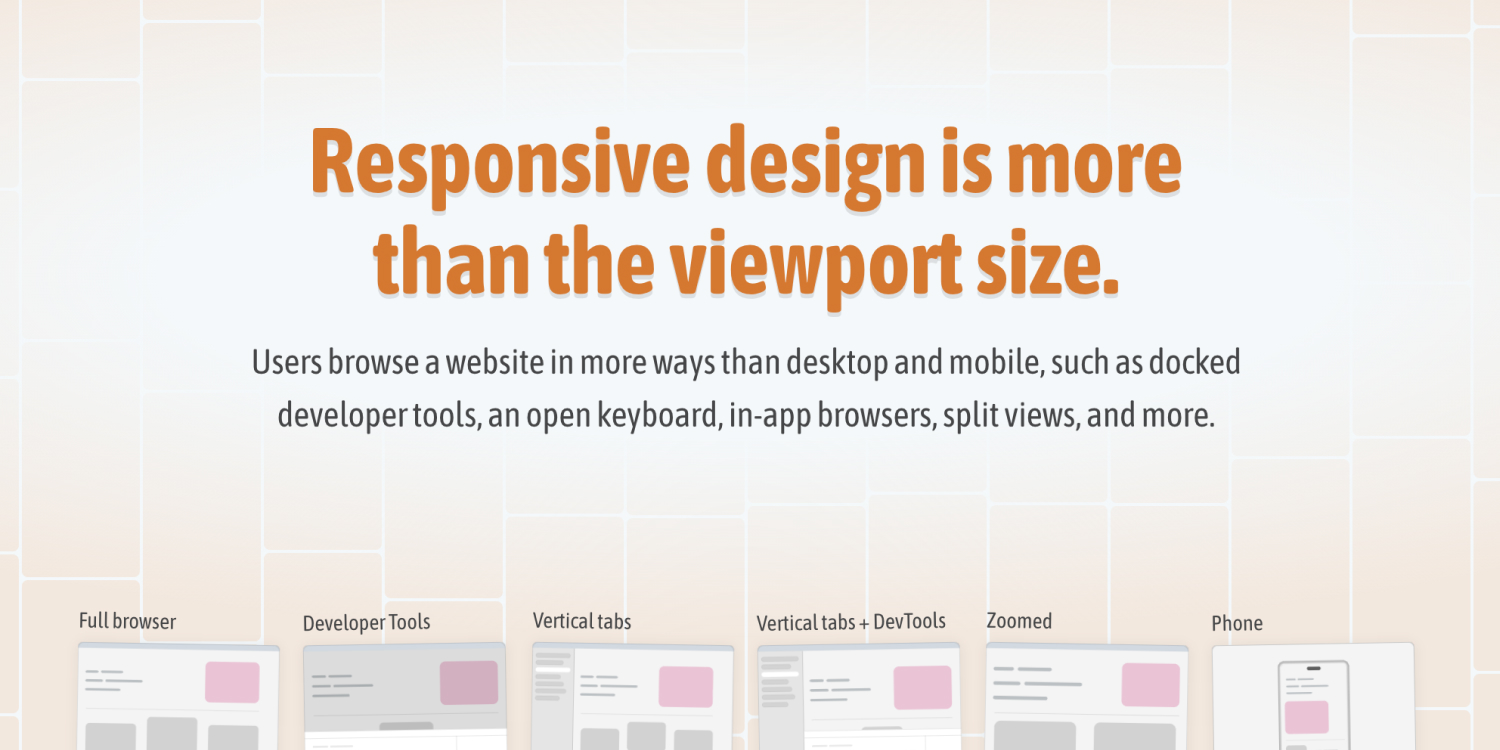
We care about responsive design while building a web product, and this means working with media queries or container queries to have a robust end result. However, few of us think about the big picture: how a website is used by real users in real contexts. There are so many variations other than resizing the browser window or viewing a design on mobile and desktop.
Ahmad Shadeed